Before and After
Five times the work got a point of view.
The befores are what I inherited. The afters were made under my direction.
Take Control of YOUR Career
From stock smiles and a line any school could run to one idea the program could prove: this MBA bends to your life.


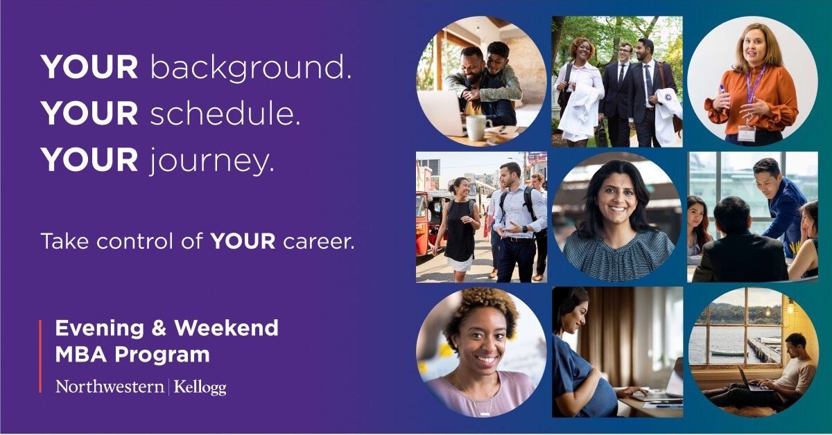
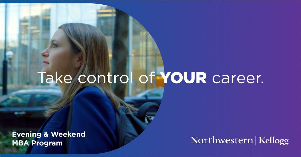
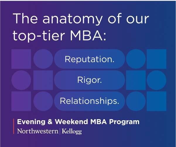
What changed
The program had real news: more remote options, more ways to set your own pace. The ads sounded like every other school. We built one idea on that news and carried it across paid social, email, landing pages and long-form student stories.
What it did
Launched in a year the program needed a turnaround, and helped reverse a multi-year decline.
When the second phase softened, we didn’t defend the work. We changed the messaging, and the third phase outperformed both earlier phases.
You’re Ready.
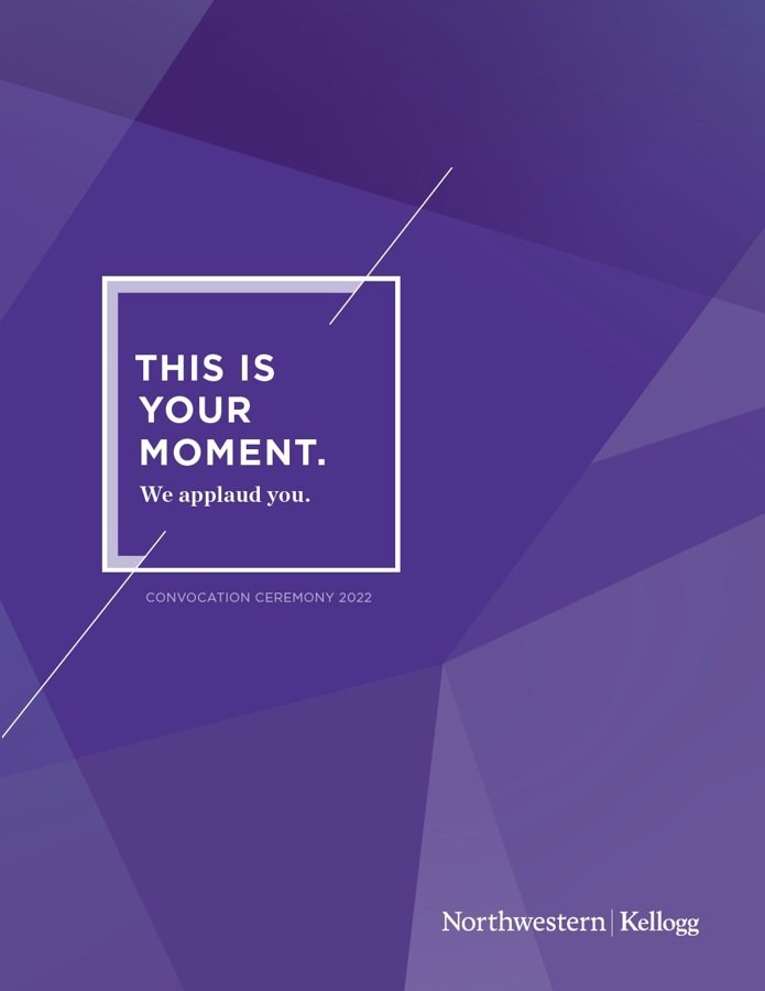
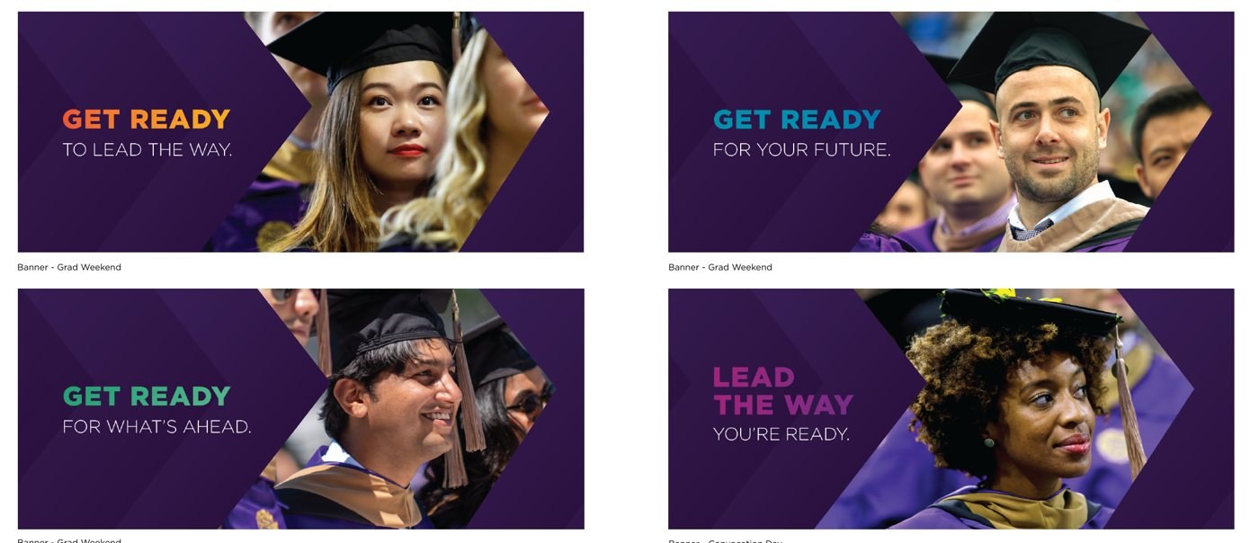
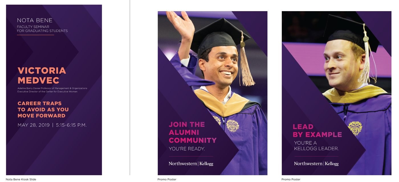
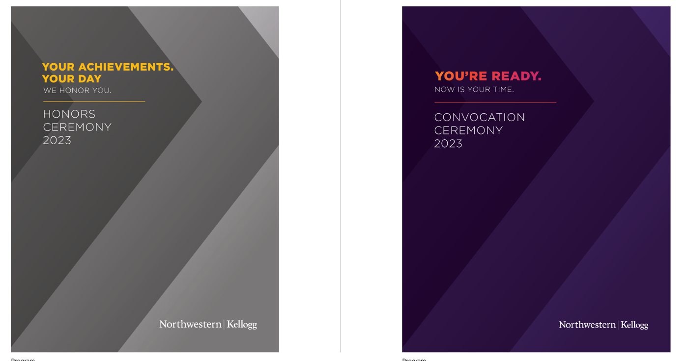
From a polite “This is your moment” to one message carried through the whole graduation season.
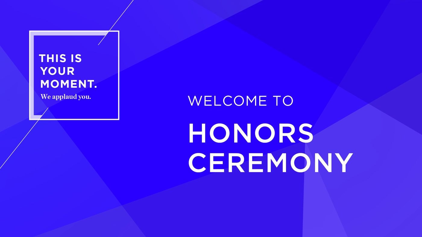
What changed
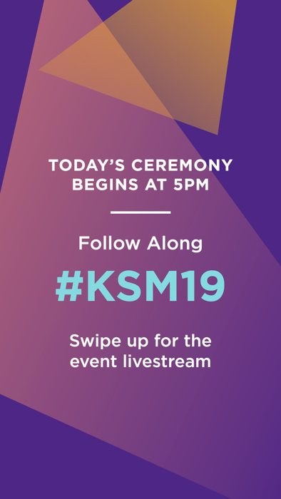
One line, You’re Ready, ran from the faculty send-off through alumni recruiting, Grad Weekend, the Honors Ceremony and Convocation. Each moment got its own version of the same promise.
How we got there
New project frameworks protected thinking time and brought partners in early. That gave the team room, and permission, to be different. Confidence grew, and partners worked with us as collaborators instead of clients.
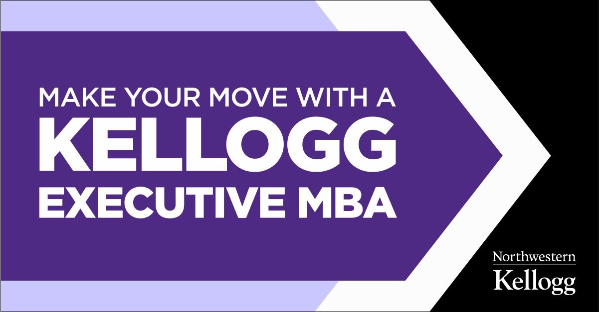
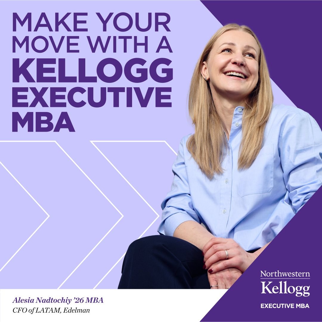
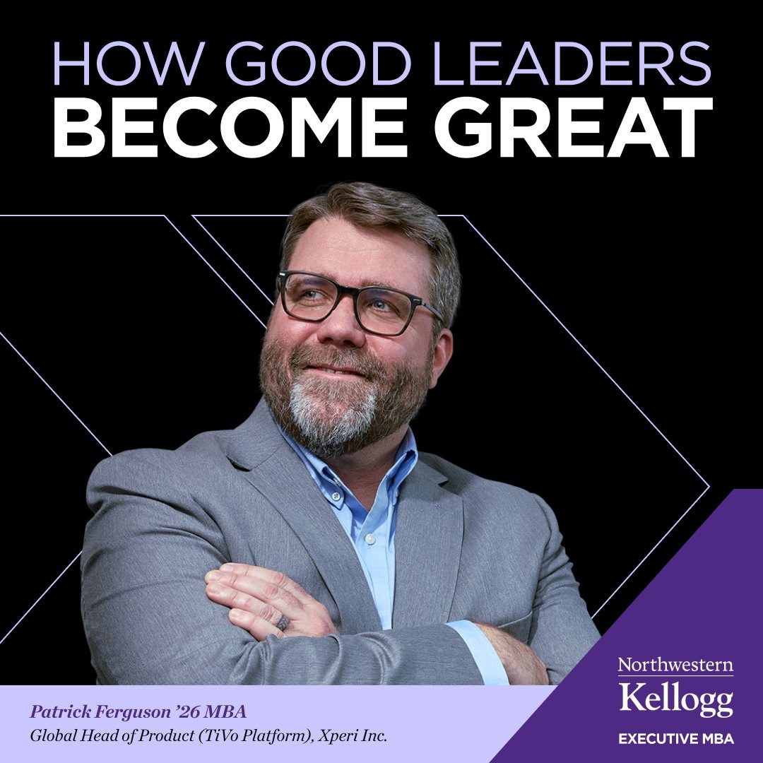
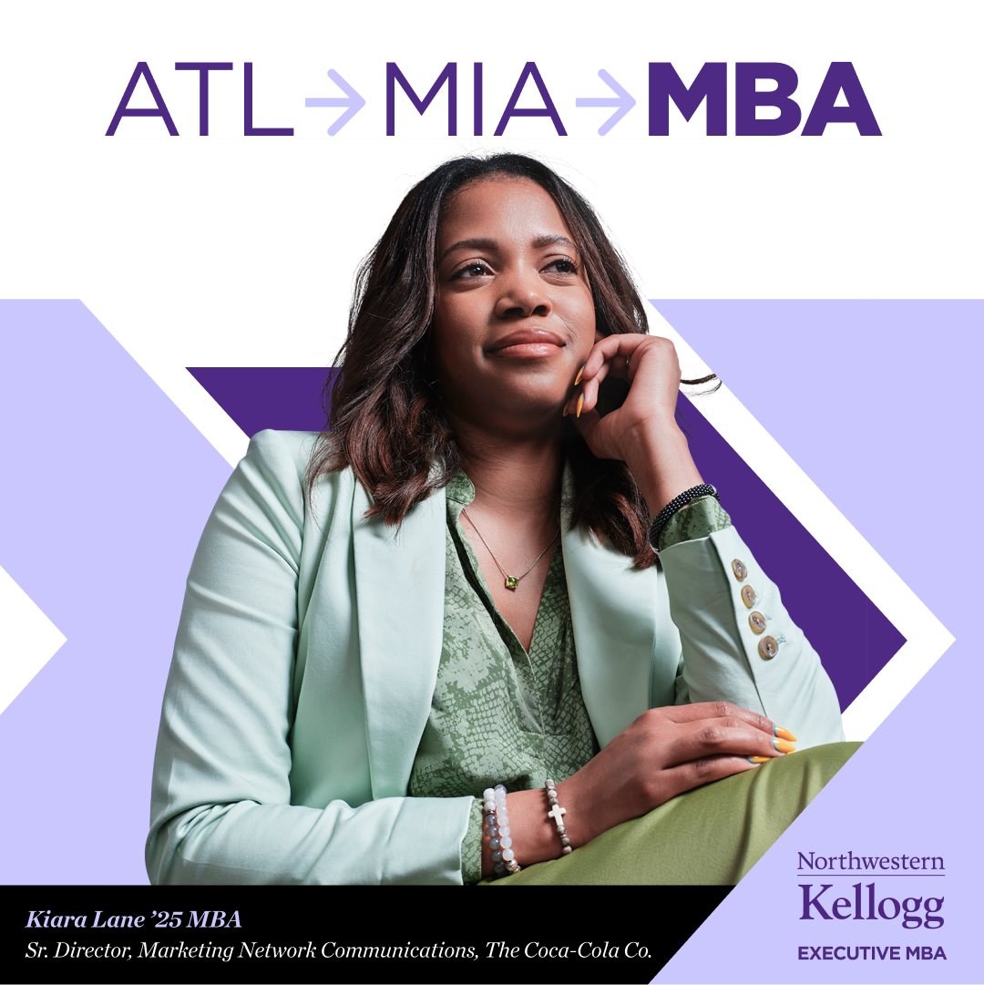
Make Your Move
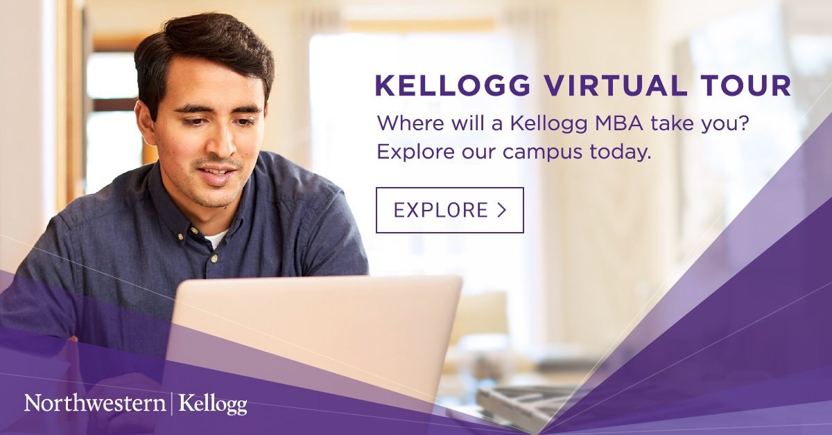
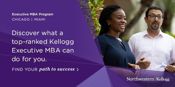
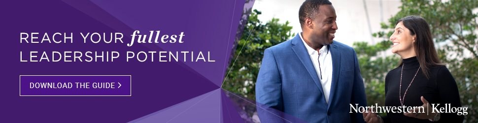
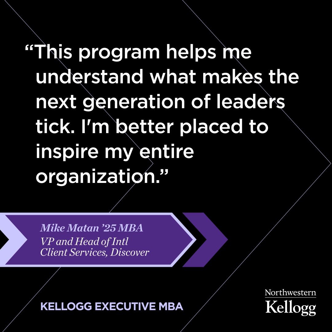
From stock photos and soft promises to bold type, real executives and a point of view.
What changed
Make Your Move, for the Executive MBA, set the new direction: bolder, cleaner, more confident. Real alumni lead the work with their names, titles and companies, so prospects see who they would be sitting next to. Video moved to a documatic style, part documentary and part cinematic, built to make people feel something on the way to a hard decision.
What it did
In head-to-head testing, the new creative outperformed the ads it replaced, winning on both clicks and cost per lead where it mattered most. It became the direction for Kellogg’s other degree program campaigns.
Human stories scaled. A faculty post reached nearly twice the typical LinkedIn audience.
The film
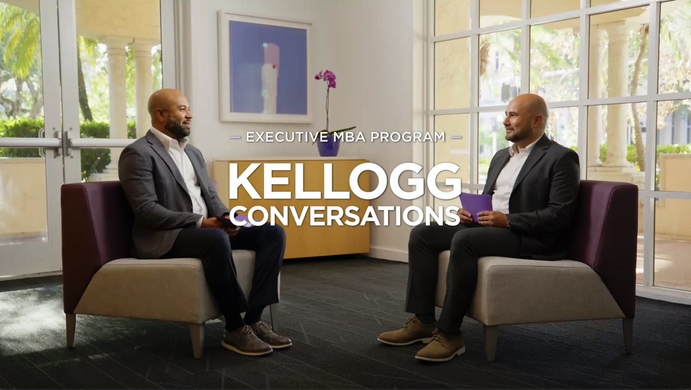
We didn’t interview them. We paired them.
Faculty, students and alumni, face to face. No interviewer. No lecture hall footage. No tired tropes about transformation. Just unscripted conversation about ambition, pressure and the moments that changed everything.
Three cameras, no script, no voiceover: part documentary, part cinematic, lit and framed so the conversation stays intimate.
The idea behind the whole campaign: leadership isn’t a solo act. Success happens in bold company.
Kellogg Candids
Not a day in the life. A real one.
An unscripted series that hands students the camera. Self-shot footage of commutes, classrooms, family dinners and work, cut with sit-down interviews. Nothing polished out: the trade-offs, the rigour and the pressure stay in.
Delphine Gardère ’25 runs a family business in Haiti and timed her start around her kids’ school year. Whitney Mercilus ’25 went from the NFL to founding his own company.
Candids started with Evening & Weekend, where it was the top-performing organic creative, with Instagram engagement above benchmark. It earned a second season for the Executive MBA, where Delphine’s film is the campaign’s most-watched.
From a Logo to a Language
The people inside the brand already loved it. The challenge was giving them the words, visuals and confidence to share that love with the world.
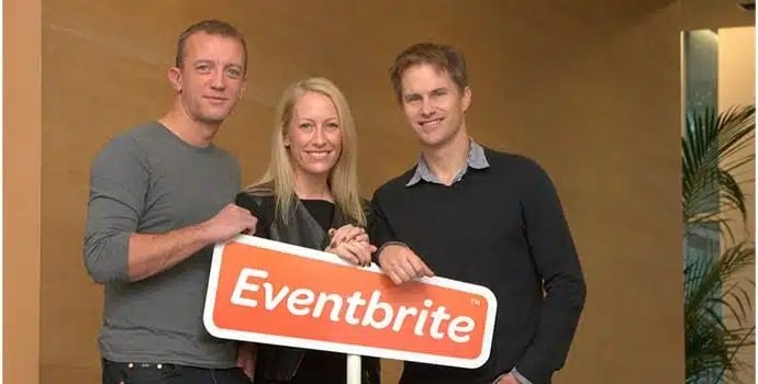
A well-loved logo, and not much else written down.
What changed
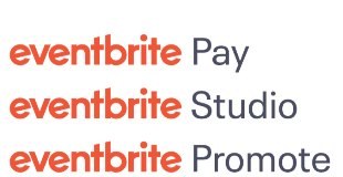
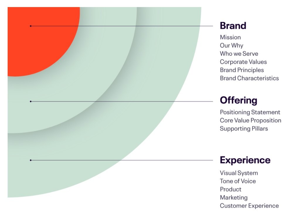
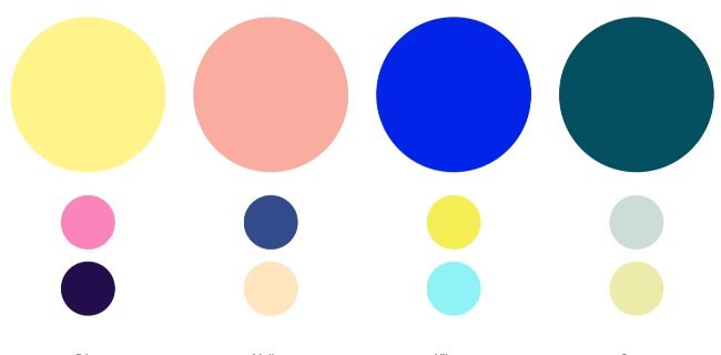
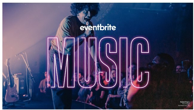
Culture was strong. Story needed structure. We created Eventbrite’s first brand book: digital, design-forward, equal parts inspiration and instruction.
What it did
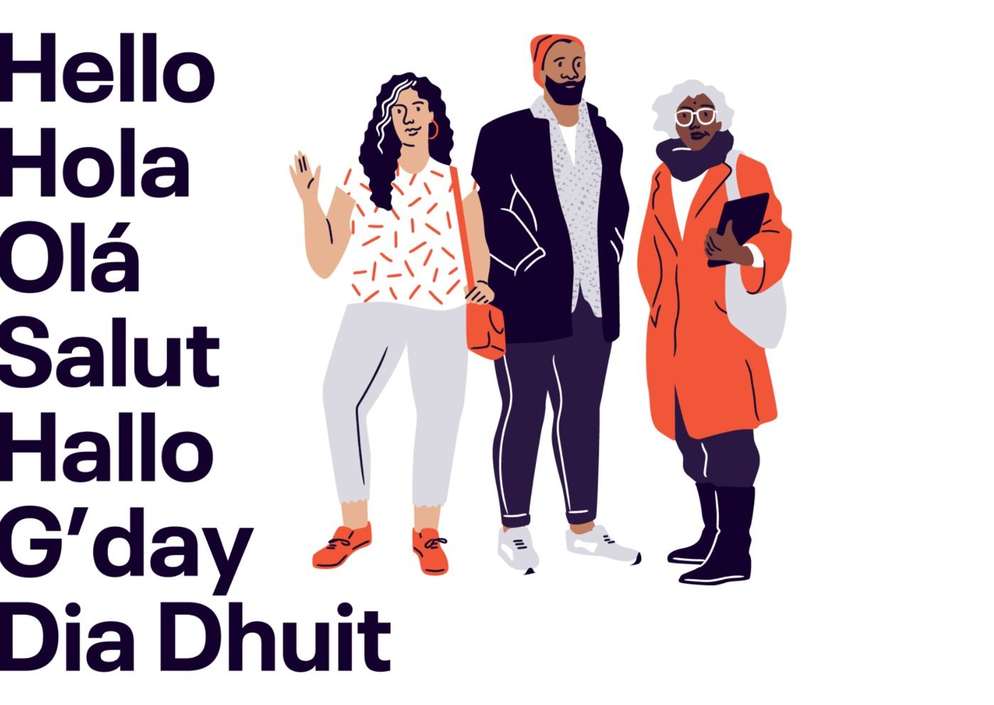
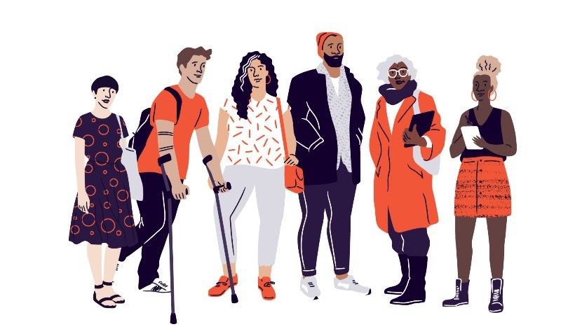
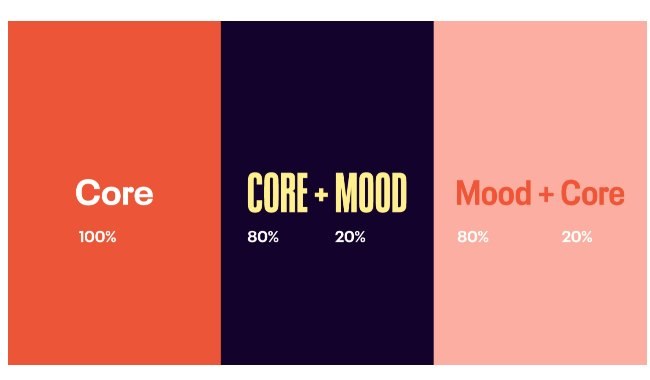
It defined the core value proposition for the first time, broke down the elevator pitch, and mapped the brand with diagrams, definitions and voice principles. Then it gave everyone the tools: the wordmark and product family, a colour system of four moods, brand blends, illustration, photography and naming rules.
Less like a manual, more like a manifesto. Just enough structure to make it scalable, and just enough soul to make it stick.
Bring Back the Spark
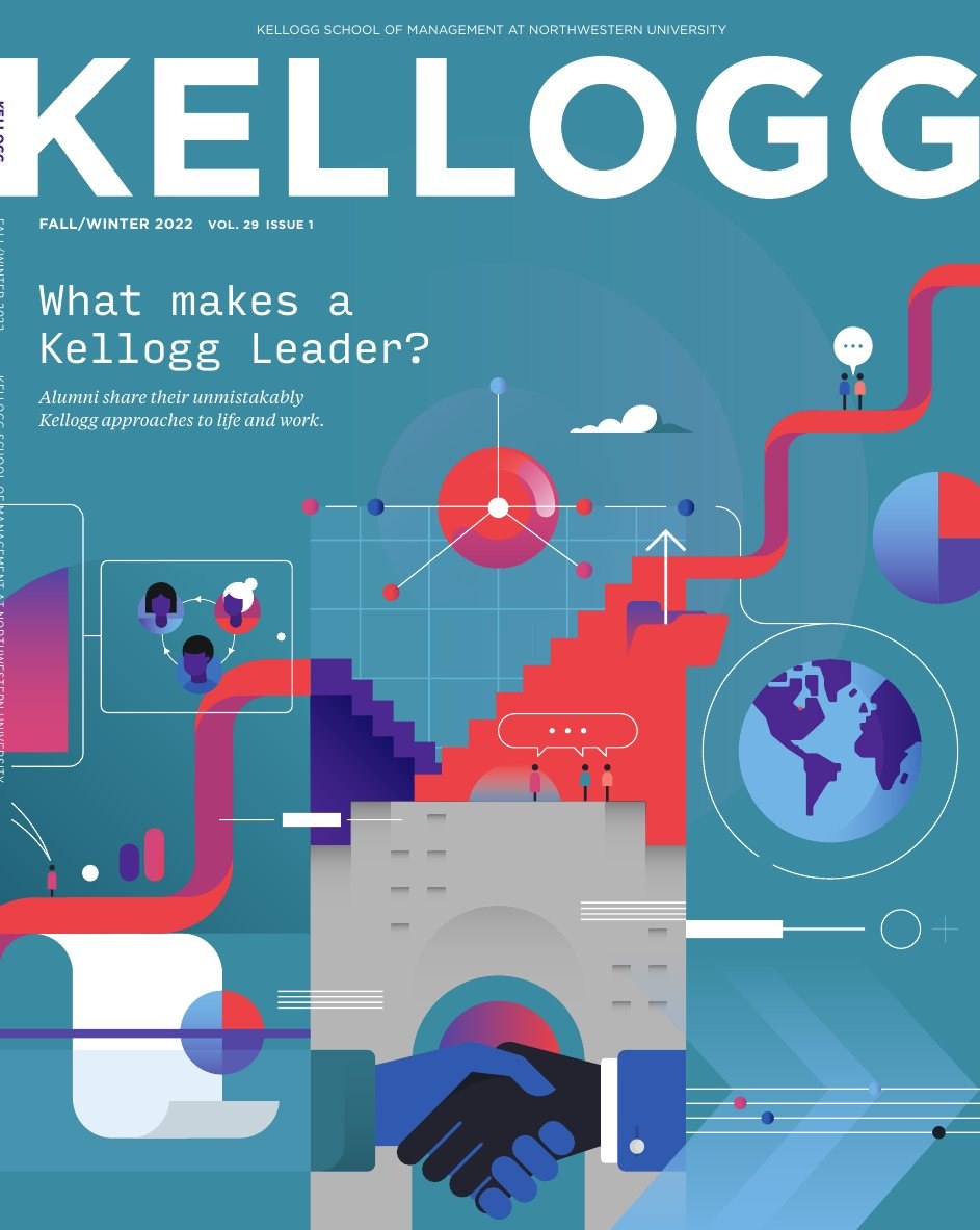
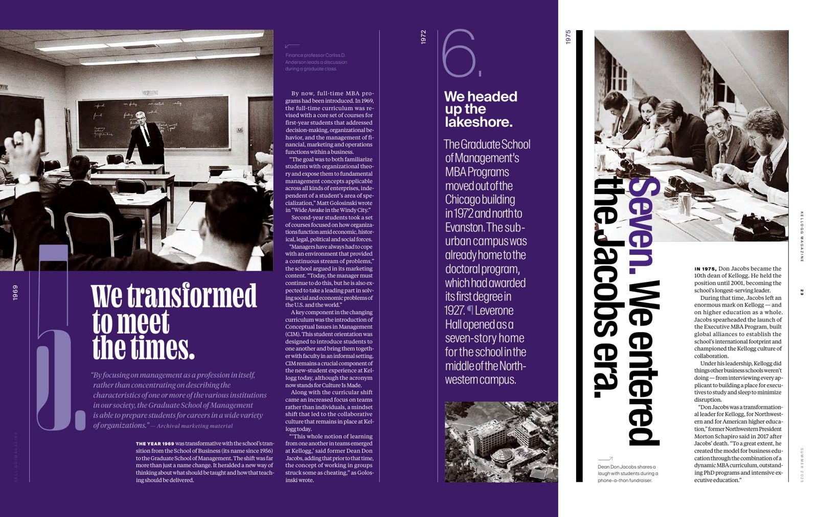
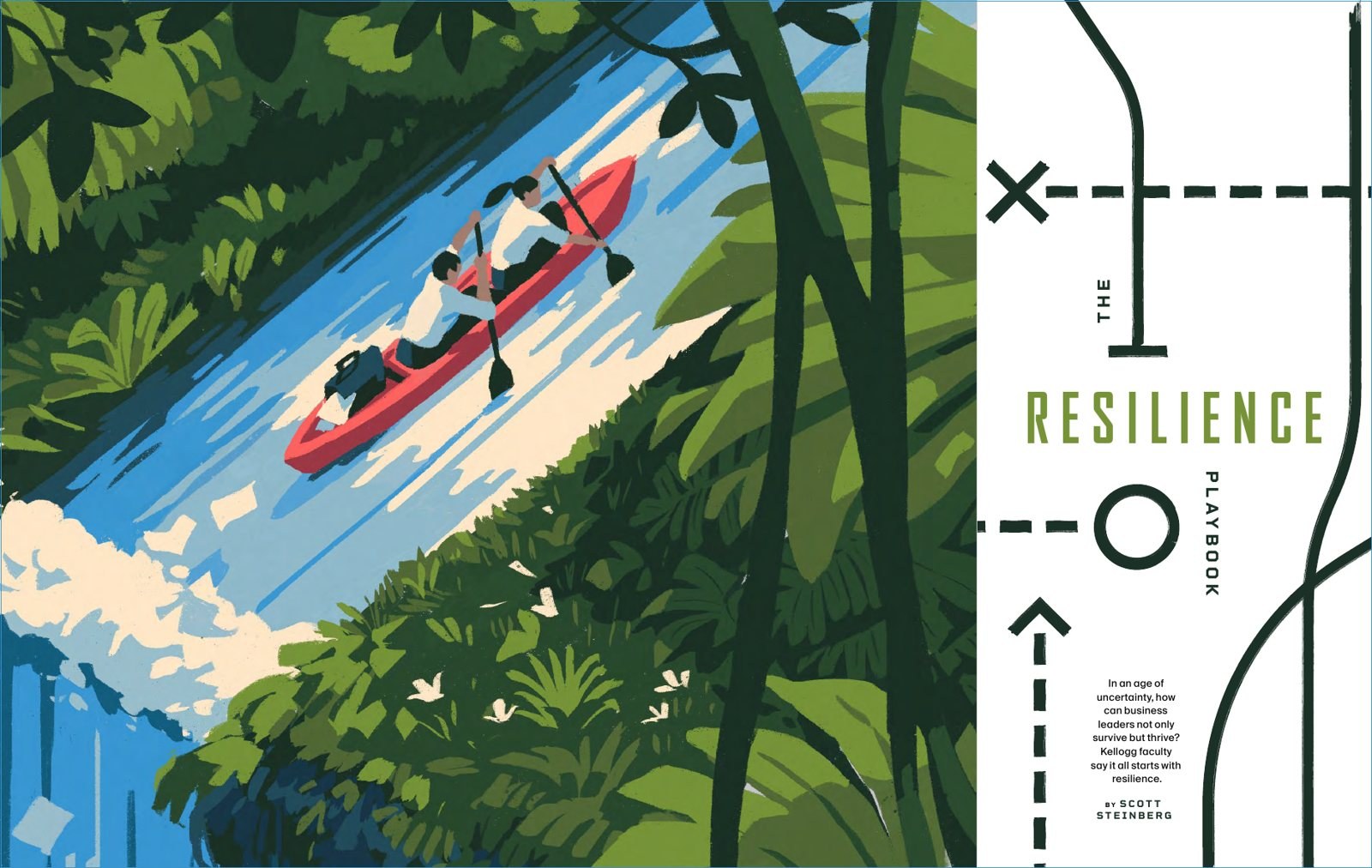
Readers already loved the print magazine. The design had stopped giving them a reason to.
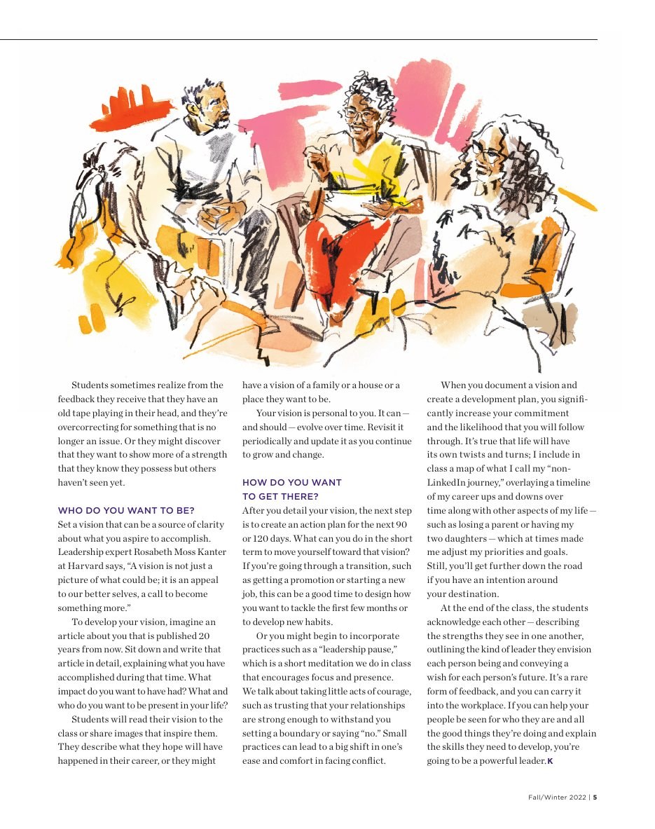
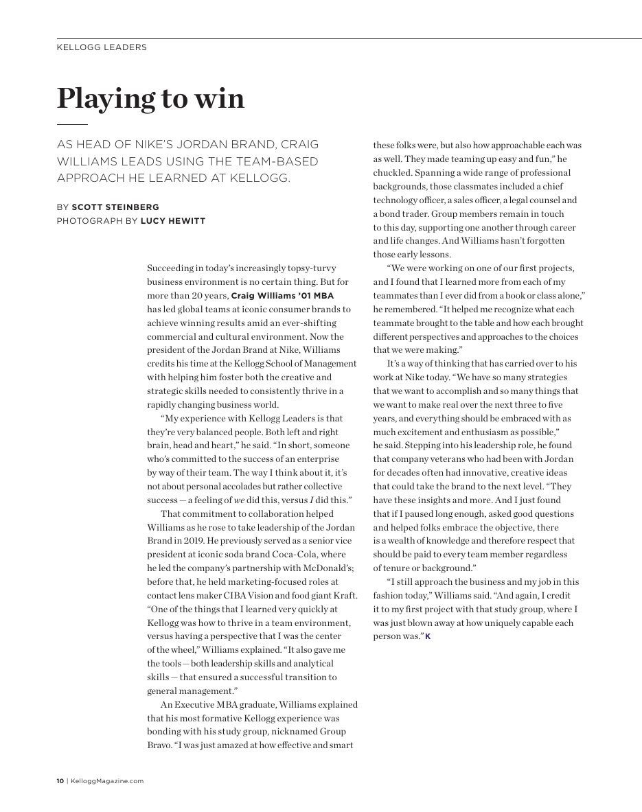
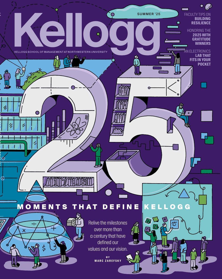
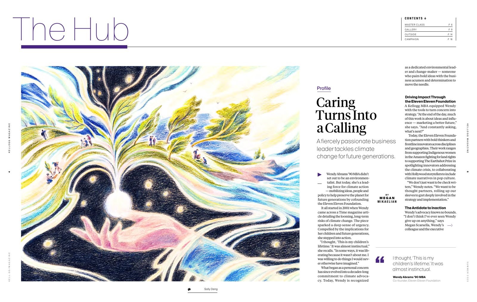
What changed
A new masthead, type system and grid, recurring departments like The Hub and Network, and features where the story angle drives the visuals. Built to work for alumni from their 20s to their 80s, and to stay fresh issue after issue without feeling like a template.
Why it matters
70% of readers read most issues and 82% spend at least ten minutes with each one. The longer alumni read, the more likely they are to engage, volunteer and give.
High standards, zero tantrums.
Coming next: the Kellogg website redesign.
Different rooms, same move: find the one true thing, give it a point of view, and build a system people can actually use.